I bind is a business management application focused on helping from large business teams to a single freelancer. It has many uses and helps with the classification and organization of tasks. The most relevant functions that can be carried out with the program are the following:
- Create reports on orders, sales, goals, and collections.
- Manage sales visits and agendas.
- Save catalogs, products, prices and offers.
- Make payments and collections.
- Create task lists.
- Consult results statistics.
- Report call information.
It bases its actions on helping companies achieve their sales goals and improve their customer service, which is why once they try it, it becomes indispensable for their operation.
In this case, Vinco needed a logo design that represented a modern and technological service set in the world of management and work organization.
The link between a new logo and the creation of a style book
Logo design and first impressions
Most brands are recognized by their logo, which is why it is vitally important that it is modern and conveys the company's values. For this reason, we have created a simple logo that is adapted to what the public is looking for in this type of service: simplicity, effectiveness, speed and regular updates that improve the final product.
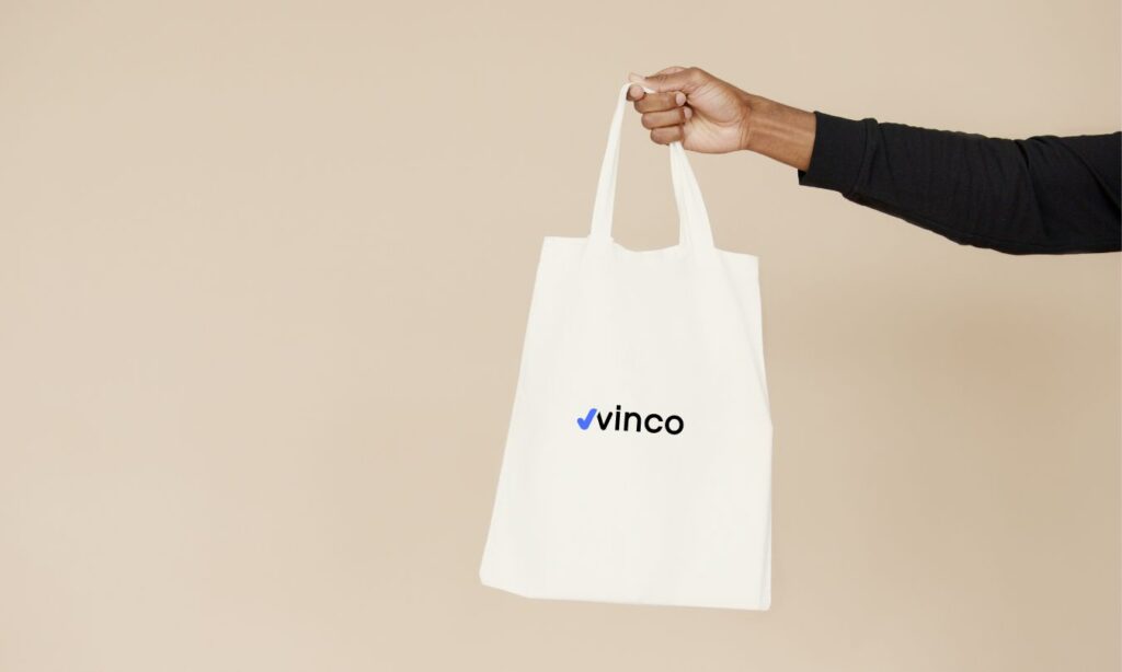
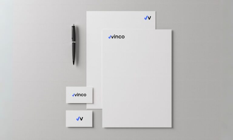
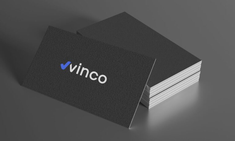
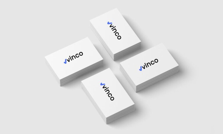
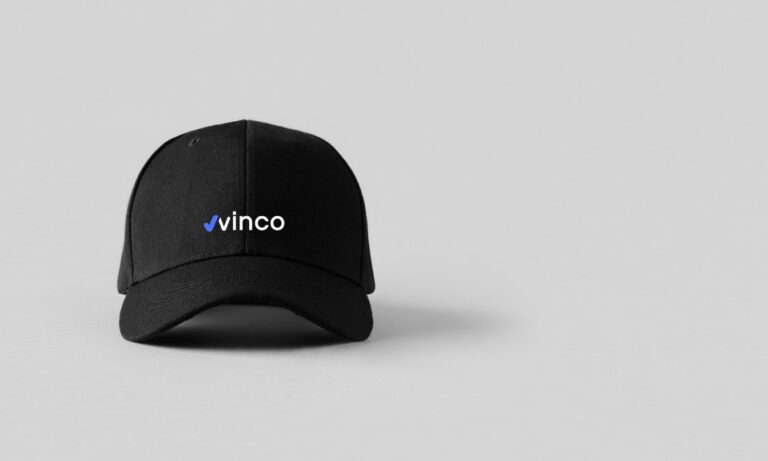
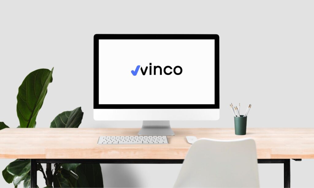
This new logo design stands out for being elegant and modern. The full brand name appears in a neutral color, black, while a “tick” symbol shines in a bright blue. This combination manages to capture attention instantly.
The “tick” symbolizes control, the main function of this application: internally managing a business to maximize its profitability. The typography chosen is professional, fine and elegant, conveying an image of reliability and seriousness.
The design of the blue “tick”, together with the first letter of the brand, the “V” in black, provides a technological touch that highlights the logo and gives clues about the brand's field of action. In short, it is a logo that perfectly combines modernity and functionality to capture the public's attention.